Saint Alice
Bar & Eatery
Brand Identity, Menus, Comms & Signage
Saint Alice of Schaerbeek, patron of the Paralised, may have been the inspiration behind the name however getting paralytic wasn’t the underlying brand essence.
A simple story was created around the enigmatic Alice being great company and a welcoming friend to share the incredible views, warm space and great hospitality with.
A custom typeface was created with art deco influence inspired to match the interior design. The typeface would also spell the logo when written as ‘Saint Alice’ and the branding was built around writing copylines with ‘Alice’ in them rather than using the full wordmark seperately, along with adding the ‘SA’ monogram to sign off the communications.


-
![]()
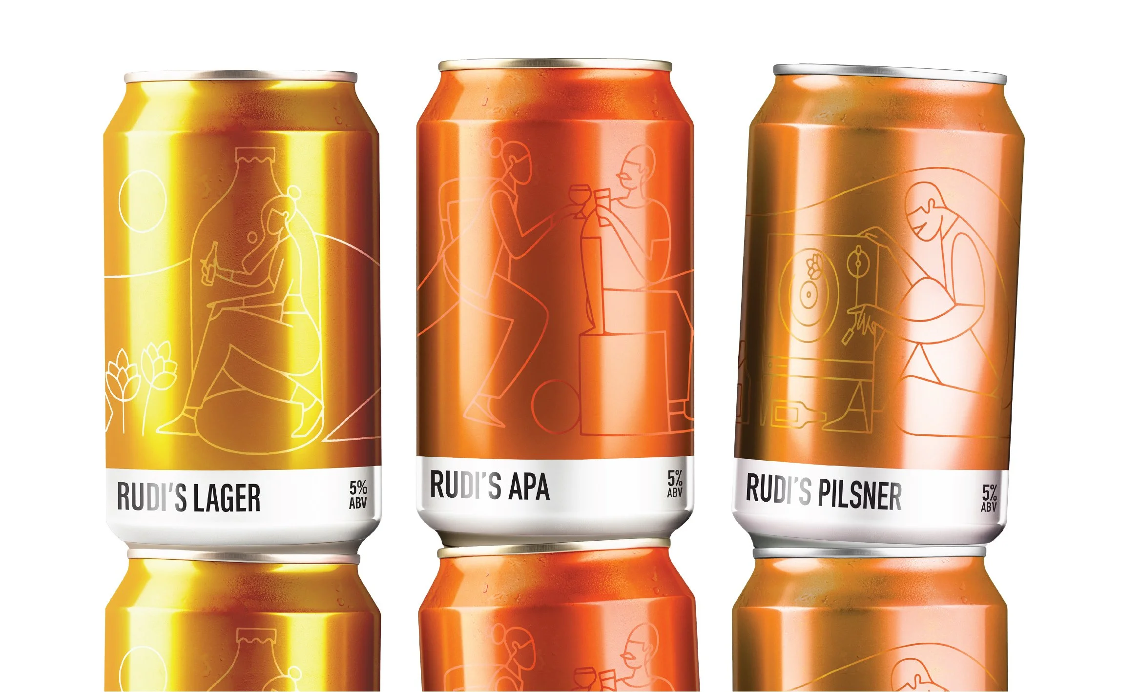
Rudi's
Brand Identity, Packaging Design & Comms
-
![]()
Customary
Naming, Brand Identity, Marketing Collateral
-
![]()
Good George
Brand Comms, Packaging, Signage
-
![]()
Jumping Goat
Naming, Brand Identity, Packaging, Bottle Shape
-
![]()
Shed 530
Branding, Wine Labels & Comms
-
![]()
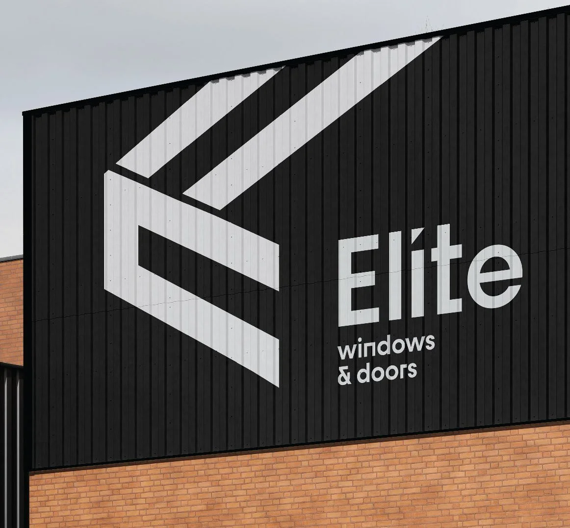
Elite Windows & Doors
Branding & Website Update
-
![]()
Fantail & Turtle
Brand Identity & Collateral, Signage
-
![]()
Saint Alice
Branding, Signage & Menus
-
![]()
Kaiser Brew Garden
Brand Identity & Marketing Collateral